
01. Challenge
It’s been said we’re living in accelerated times – leaving many of us feeling lost and out of control in a world of economic, technological & cultural change. It might explain why so many consumers are turning their attention inwards, to things we have more control over: like our minds and bodies. Today’s consumers are seeking additional benefits from everything they eat and drink – choosing products not just for taste or refreshment, but for functional benefits that promise to help them achieve a more ‘optimal self ’.
Create a drinks brand that has a functional benefit beyond the primary purpose of refreshment.
02. Insight
Teenagers face many personal challenges that can often leave them feeling anxious and confused. This is all amplified by the presence of social media which can make them feel lesser due to the curated online personas people keep.
With the recent increase in popularity of mental health discussion in the public sphere, this is the ideal time to release more products that focus on spreading that message in the actual communities.

03. Solution
Tōku is more than just a drink. While it does include ingredients that help with anxiety the focus of the drink isn’t on its contents but on the social landscape it can create.
Tōku means to become a bridge between people who want to talk about their issues but aren’t comfortable doing so with their friends or relatives out of fear of being judged or excluded.
04. Identity
The symbol mark is inspired by comic book speech bubbles, and is stylised to have a friendlier look, with the rounded corners, deliberately incomplete outlines and round stroke caps.


The name itself is drawn in a more stroke-based style, akin to Japanese hiragana, both to play even more into the friendly style and to make the Japanese name of the drink, Tōku, feel more at home.
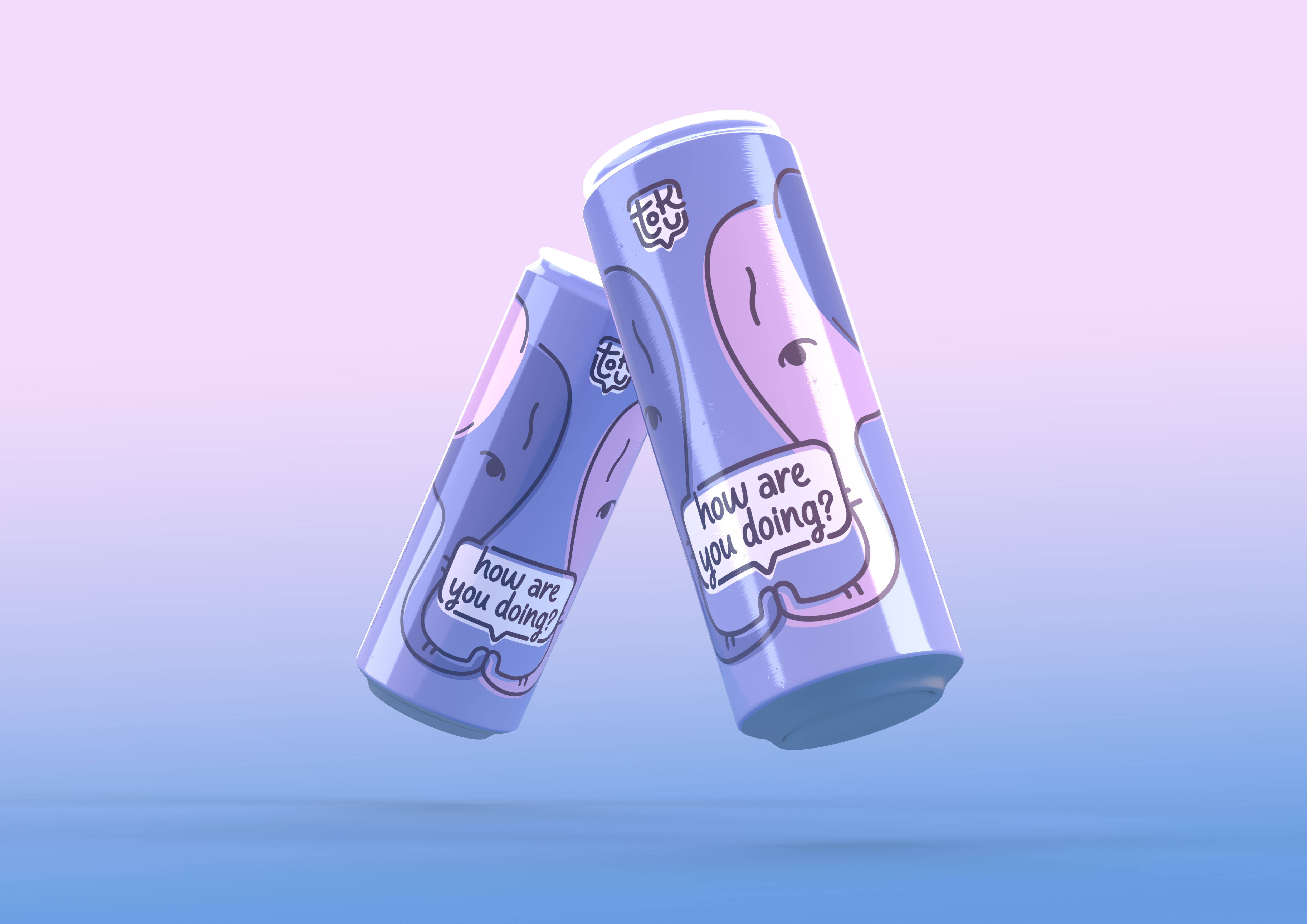
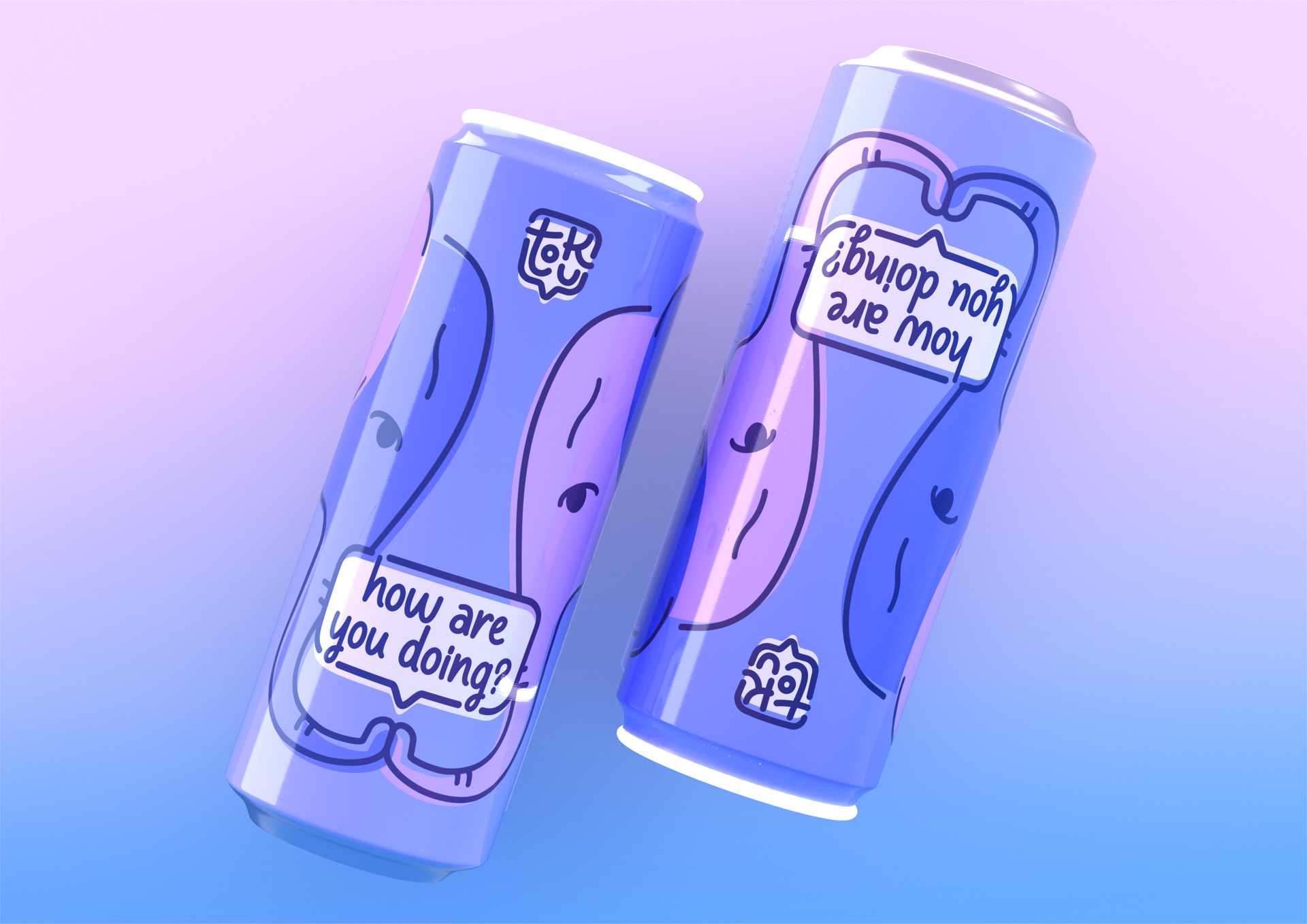
There are two colours used in the brand palette. The choice was based on the World’s Favourite Colour report which identified them among others as the Colours of Relaxing and Tranquil.
The illustration has the colours cross-referenced to show how each elephant has the part belonging to the other.

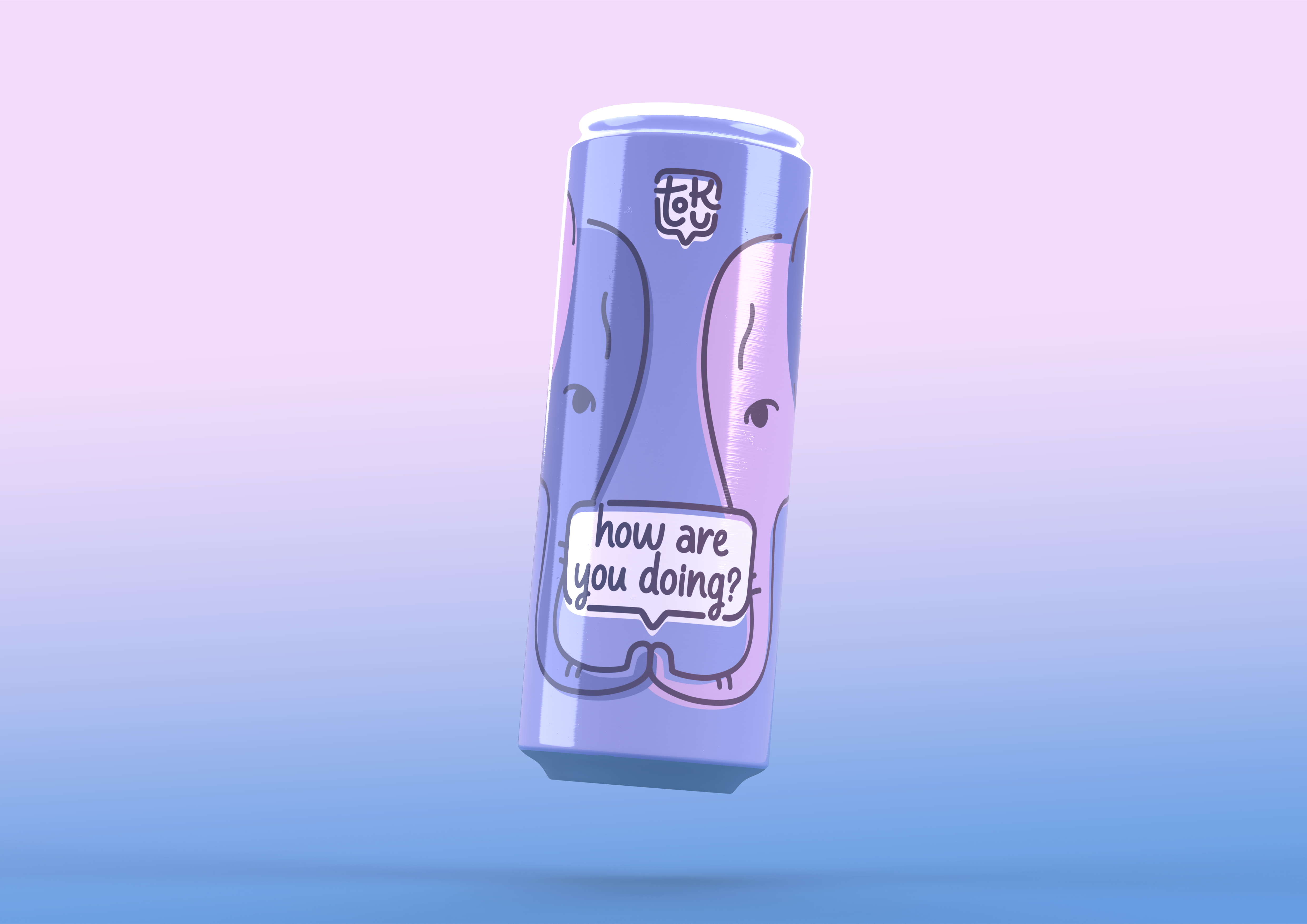
05. Packaging
Starting from the shape of the can, to the gloss of the finish to the front crop of the illustration, the packaging design has been carefully crafted to elevate the user experience.
A slim can was chosen for its ease of use, being easier to hold for varying hand sizes. The tallness of the can helps keep the glowing ring visible.
The slim, tall fit makes the can easy to hold in one hand, as opposed to bulkier solutions. Its tall posture also helps keep the glowing ring — the Call-to-Action — visible. The ring was added as a feature to make the can stand out in pubs and such as a beacon to show that someone is willing to talk to another stranger.
The finish of the can has been finely tuned to have a glossy, cel shaded like look which works well with the illustration and mark to complete the cartoon-inspired identity.
06. Future
Considering the sudden rise in mental health awareness, Tōku has a big opportunity to further expand as a brand and as a community through advertising.
A focus on merchandise is important as people will trust other people more than impersonal advertising when it comes to opening up.
