01. Challenge
Work as a group of 4 – 5 people to design materials for an exciting upcoming exhibition on the Woodstock festival based in the UK, the location and structure is up to you.
The exhibition is primarily aimed at the general public, however, a private view inviting public figures and/or celebrities is also planned.
02. Insight
Both the Woodstock festival and the Vietnam war are experiences known for being gritty and “real”. They are also very polarising in what they were trying to achieve.
Although it was set up with good intentions, the Woodstock festival ended up being destructive for the area, and the Vietnam war is by definition polarising.


02. Solution
Biases in the creation stage of an exposition of this political impact would put us in the position where we focus on one side more than the other instead of presenting a balanced argument.
If we are to make a successful exhibition it is best to make it educational and present the fact as they were and leave the people to draw their own conclusions.


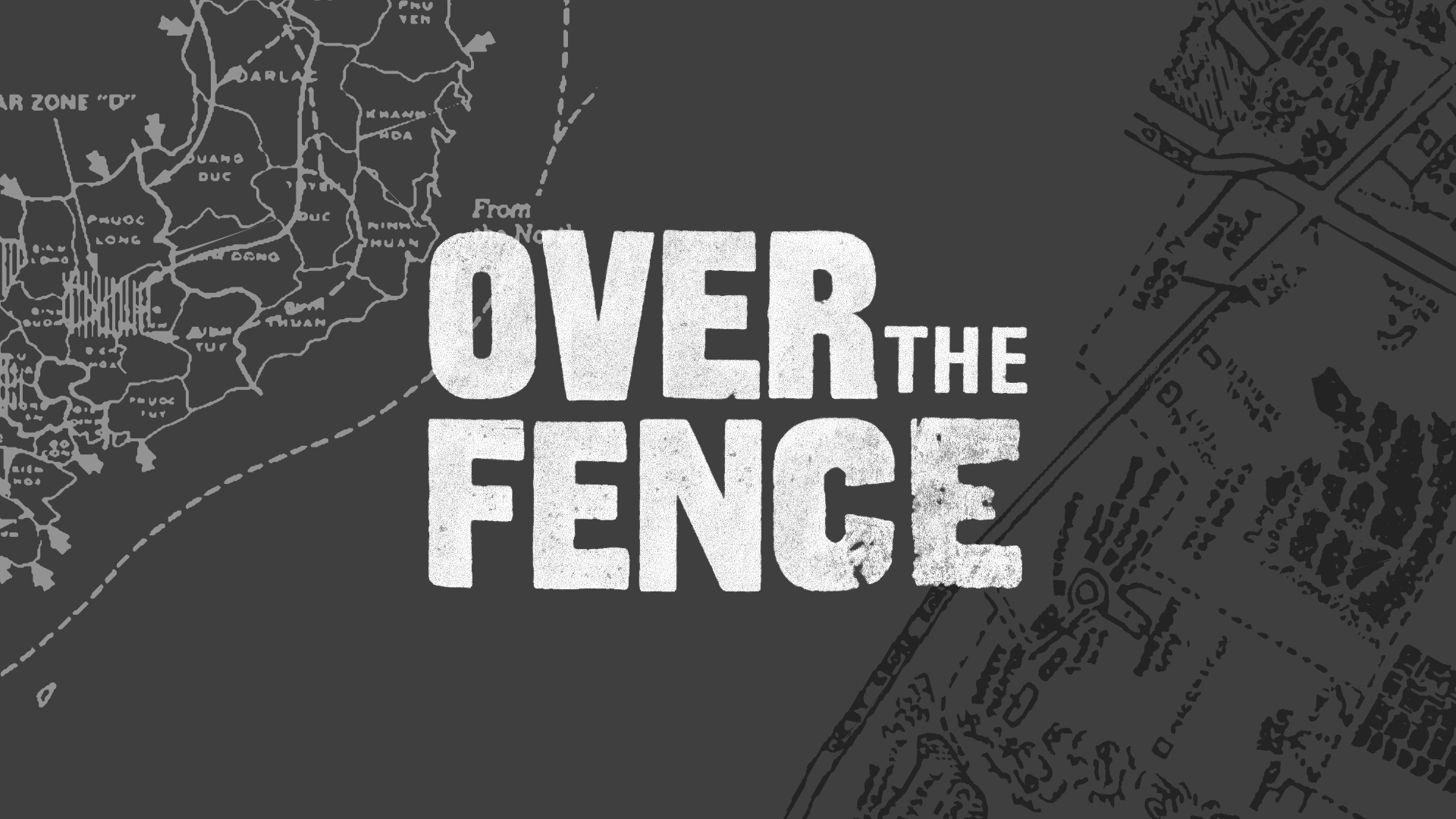
03. Identity
The name of the exhibition is based on a commonality between the two events.
On the Woodstock side people climbed over a fence to get into the festival to avoid paying while on the Vietnam side it was a term used to describe going into battle or entering different Vietnam territories.


The final logo mark was created by use of a letterpress in a style that emulated the look of protest signs and military branding of the time.
We felt it was the more accurate and better looking option and it accurately portrayed the feeling we were going for.
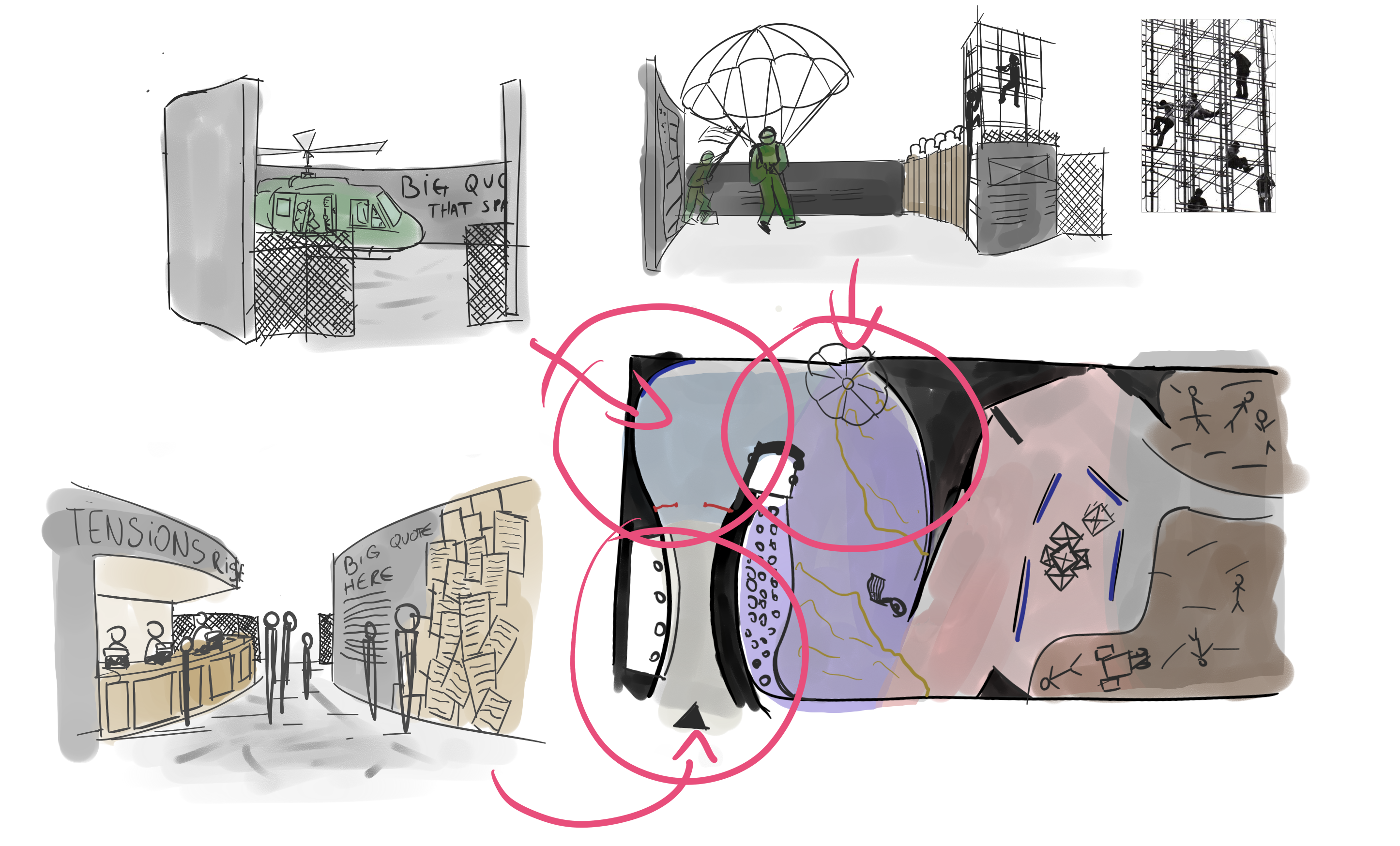
04. Exhibition
When designing the layout of the exhibition itself, I had to use multiple architectural and graphic design devices to convey as much realism to the visitors and enhance their experience.
In the end, we used devices such as:
- Shrinking and enlarging elements, such as having walls taller than the visitors to make them feel small, or place information in a place where you have to look up to, or down to respectively, to be able to read it;
- Juxtaposing and contrasting the events, with things such as soldiers parachuting in on one side, with the other having the people at Woodstock dancing in the mud, or people fallen in battle and passed out hippies. We always considered what is visible at any point when you’re visiting;
- Extending the experience from the contents to the layout of the exhibition itself, going from a cramped hallway to a small corridor that puts you in the middle of the action, to broken walls and finally a hallway with the two events counterposed on walls facing each other.


